Not less, but better.
Impulses for a minimalist living style with personality.
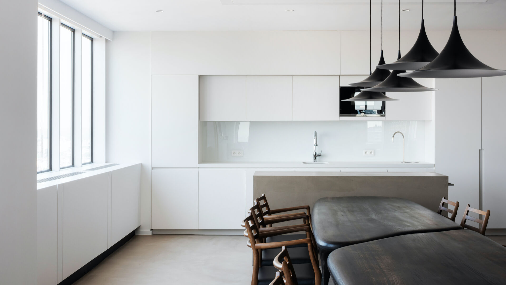
Sharpening one's own awareness. Recognizing what one really needs. Giving things new appreciation. That's what minimalism is about. Following the motto 'less is more', more and more people are embracing the desire for clarity and order - even in the design of their homes. However, the true art lies not in owning as little as possible, but in keeping the right things and skillfully showcasing them. We explain how to make your own home without having to sacrifice exciting accents and a personal touch.
The journey towards a minimalist home begins with many questions and some prejudices. The goal is not to banish as much as possible from one's own four walls and thereby destroy any sense of well-being. We all have certain things that objectively have little utility but score points for their emotional value, as they remind us of special experiences or people. However, among the 10,000 things that each German owns on average, one quickly loses sight of the essentials. Therefore, it is important to set priorities and focus: for example, on items with special meaning or timeless design classics that do not go out of style quickly and adapt to almost any room.
The main thing is harmony.
A colorful mix of colors, patterns, or shapes is less common in minimalist apartments. To prevent sensory overload, an emphasis is placed on a uniform, clean design instead of extravagant combinations. The overriding principle is the pursuit of stylistic purity, which can be broken down into three central principles: clear shapes, simple materials, and subtle colors.

About form and function.
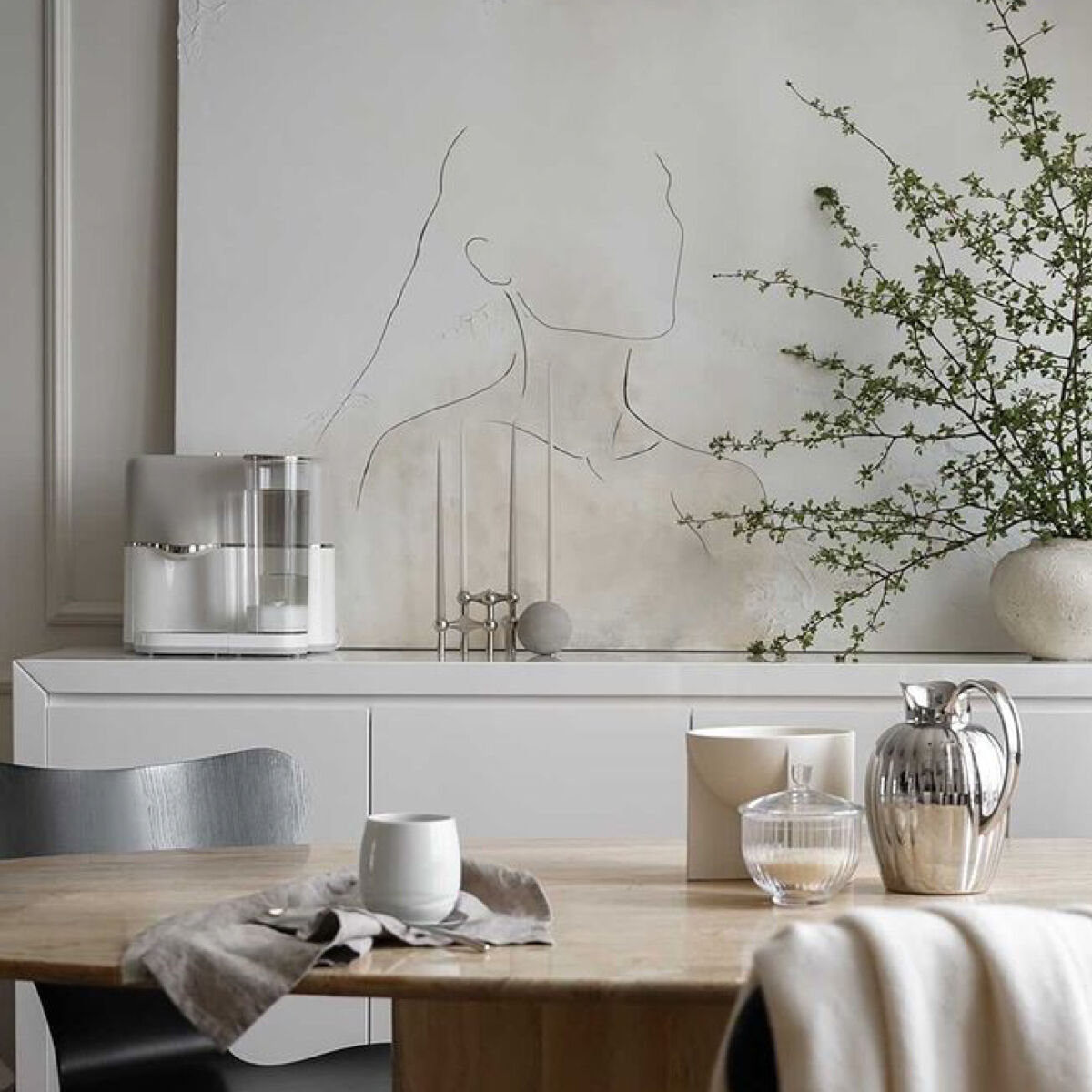
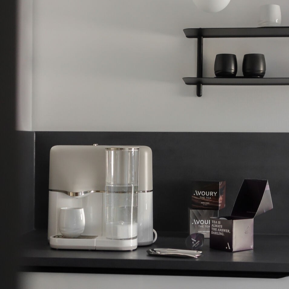
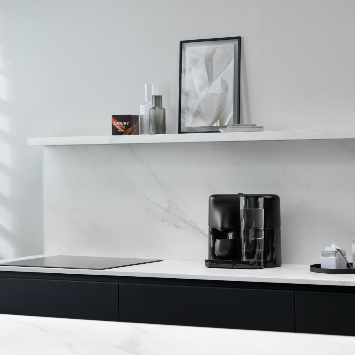
The design language in minimalist homes is reduced to the essentials, so the objects stand for themselves. The eye rests on clear lines. When choosing furniture, one should therefore focus on simple pieces in geometric shapes or with straight lines without frills - an armchair in Rococo style would be out of place. Especially with technical products, the clear design language meets thoughtful functionality. This means: Not everything that looks simple is also simplistic. Instead, innovative, complex technology is integrated into a reduced and modern form that fulfills a purpose and at the same time sets an optical accent - such as the Avoury One, for example.
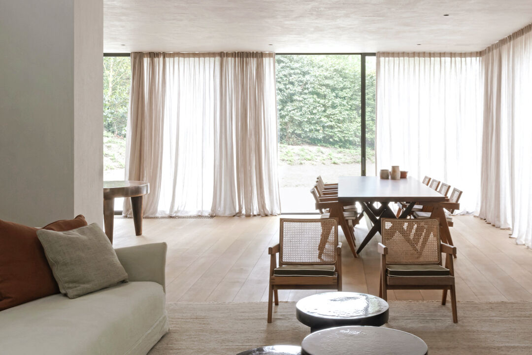
Exciting structures: When it comes to materials, it is also advisable to choose a uniform look and prioritize quality over quantity: By focusing on a few pieces of furniture or accessories, one can opt for noble fabrics such as silk or cashmere as well as high-quality surfaces made of precious wood or marble. However, a mix of different surface textures, materials, and textiles can visually loosen up a clean all-white look. When matte meets glossy, warm meets cool, or smooth meets fluffy, an inspiring overall picture emerges.
Of contrasts and accents.
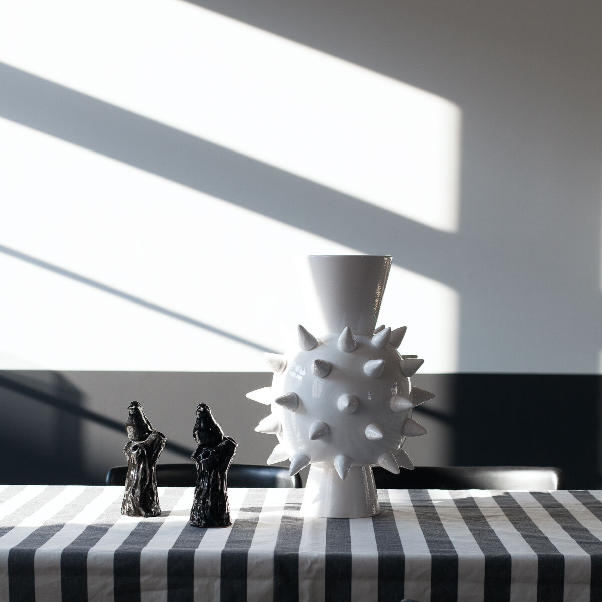
Traditionally, white is the dominant color in minimalism: Its cool purity appears neat, makes rooms look larger, and emphasizes the reduced furnishings. Similarly neutral colors like gray and black suit the minimalist living style. Especially in combination with white, black can be used to set accents skillfully - for example, with a black sculpture on a white shelf. It's best to use the entire range of shades of a color. This provides visual depth. If white, gray, or black is too cool: Light green tones or a soothing blue also fit into a puristic apartment, as do elegant shades from caramel to beige to greige - a trendy color combination of gray and beige. In general, it is advisable to follow the rule of thumb that a room needs only three colors: at most two base colors and a third for accentuation. This means that on large surfaces and walls, it is better to opt for neutral tones, while individual furniture or home accessories can be a bit brighter in color.
Decoration and reduction — (not) a contradiction?!
Despite the guidelines mentioned, there is no upper limit on the number of furniture pieces one should own in minimalism. Ultimately, the design is up to each individual. While some minimalists consciously refrain from decoration, others make a statement through selected, expressive objects. Whether a modern sculpture, a plant, or a special artwork, one's own preferences and personality can also be incorporated into minimalist homes in diverse ways.
Clear style and clear mind.
Even though decoration is allowed, not every wall and surface must be covered. Instead, in minimalism, one deliberately lets the space itself work and does not shy away from free walls. Empty wall or floor spaces make a room appear larger and provide a counterbalance to decorative elements elsewhere, which thus stand out better. Overall, a simple basic furnishing is neither boring nor monotonous, but rather timeless and versatile. This leaves enough room to add a personal touch to the space through individual eye-catchers. Moreover, a reduced interior design not only provides more space, order, and tranquility in the room, but also more clarity in the mind.
More articles
More articles

Not less, but better.
Sharpening one's own awareness. Recognizing what one really needs. Giving things new appreciation. That's what minimalism is about. Following the motto 'less is more', more and more people are embracing the desire for clarity and order – even in the design of their homes.

Should we always follow our nose?
23,000 times – that´s how many breaths we take on average per day. And that means a multitude off different scents float in through our nose evoking a wide variety of reactions in us. In this article we´ll explain the psychological reasons behind this and why we should let our noses discover new things more often.
